Category: Design
-

IBM’s New Custom Typeface Plex
IBM’s new font shares a lot of the little details which made their Paul Rand logo so great.
-
Bonsai Contracts
Bonsai provides freelance work contract templates for creative freelancers like designers and developers. Sounds pretty cool, will give it a try on our next project for sure.
-
Screenings
Screenings is a new site that collects presentations and talks on design. A great resource for anyone needing a mid-day kick in the ass to do more.
-
IM Creator XPS
IM Creator’s XPS looks to be an interesting visual website design tool akin to Squarespace‘s visual editor. I have only used Squarespace on a handful of website and the biggest drawback is their monthly billing over buying the software outright. XPS seems to be more affordable for developers and has a great free option for students…
-
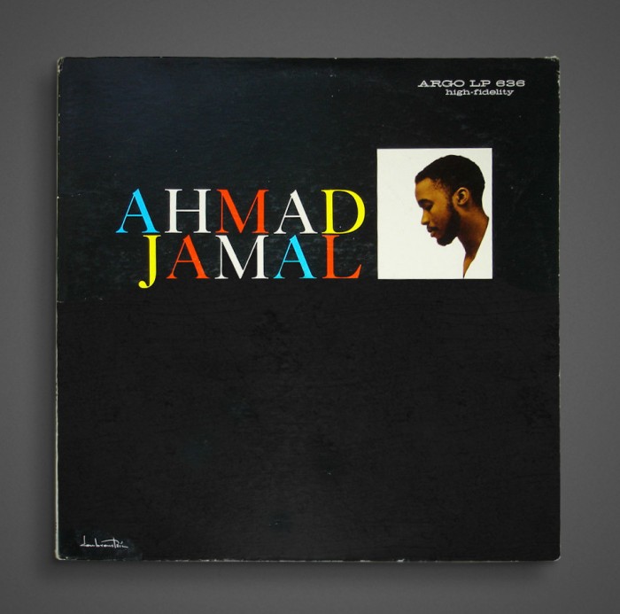
Typophonic – Album Cover Typography
Typophonic is a site about album cover typography. It is great and an awesome place to find retro inspiration. If you are a fan of Jazz covers, might I suggest Tashen’s Jazz Covers book. The print version is very expensive, but the iPad version is cheap and beautiful!