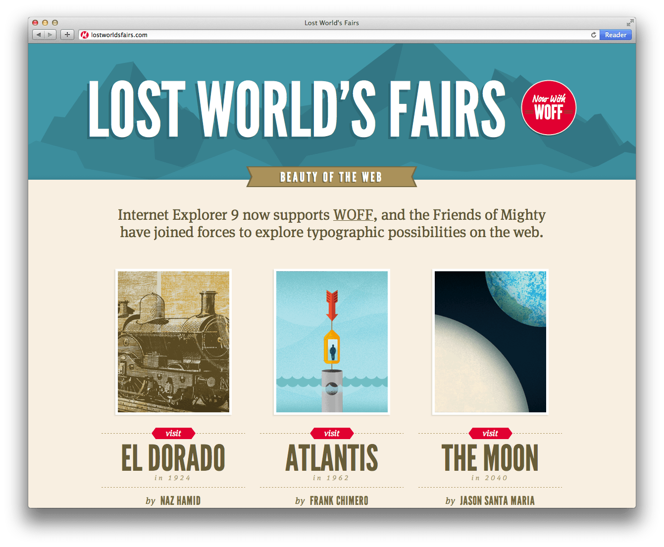
As with all things on the web, I was surfing around, minding my own business, when I came across some sweet, sweet typographic web design that blew my socks off. Blew them right out the door. I could just give you a few links, but wouldn’t it be better if we followed the links down the rabbit hole?
ALRIGHT!
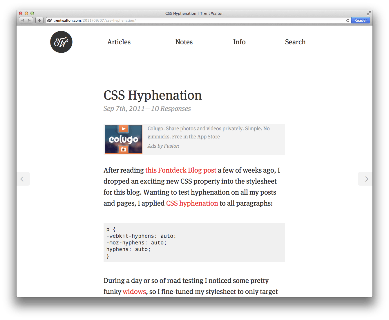
First I was looking for a website which explained a little better hyphenation on the web. I hate hyphenation at wide column widths and couldn’t for the life of me find any documentation on the hyphenation CSS tag. But then I found:
CSS Hyphenation was pretty slick. I was like “who made this site?” because it is responsive as HECK!
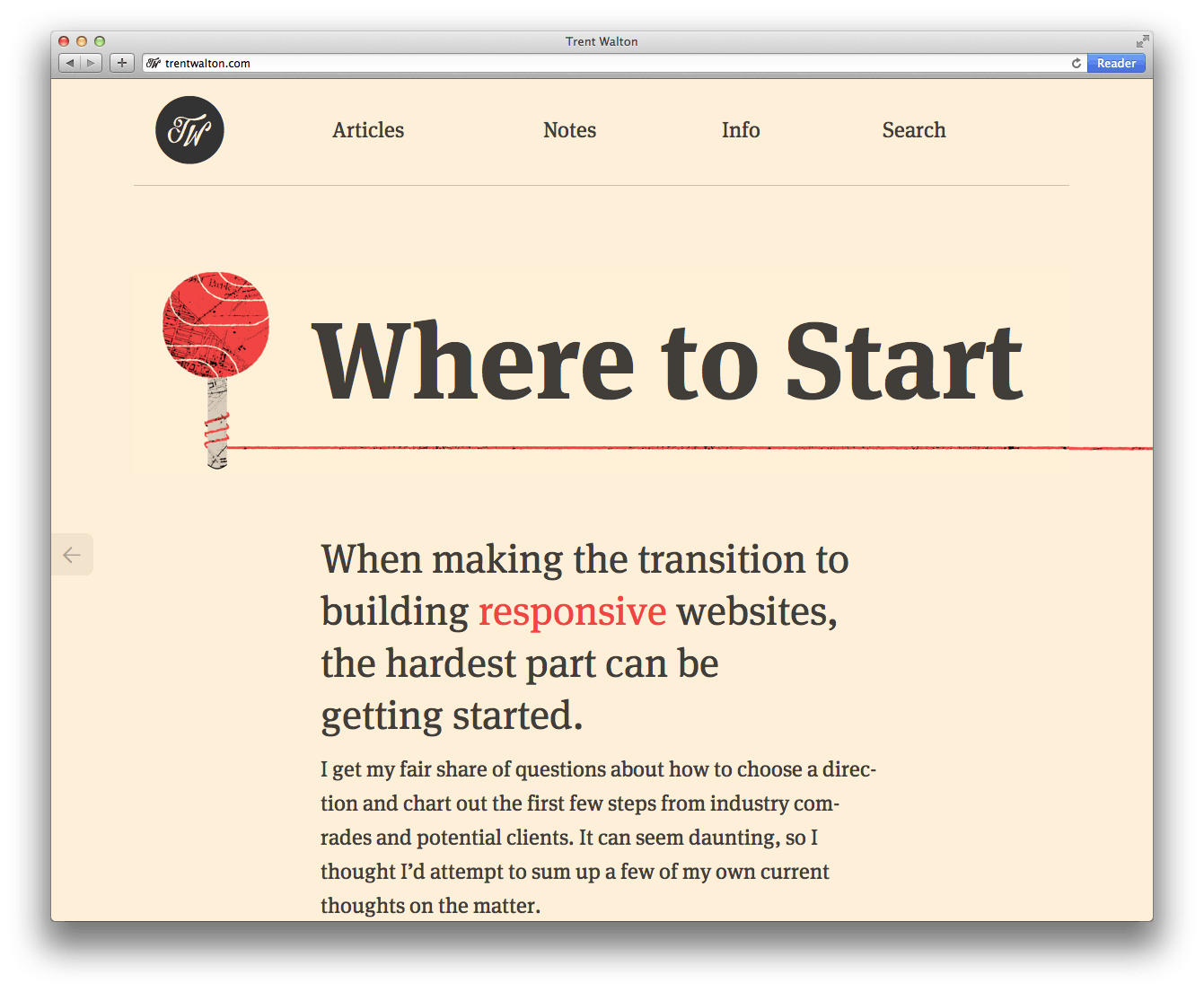
Trent Walton, WOW! I thought rubbing my eyes. How did he do that with the type? Is he a warlock?! Let me sneak around, I thought. Then I found the answer:
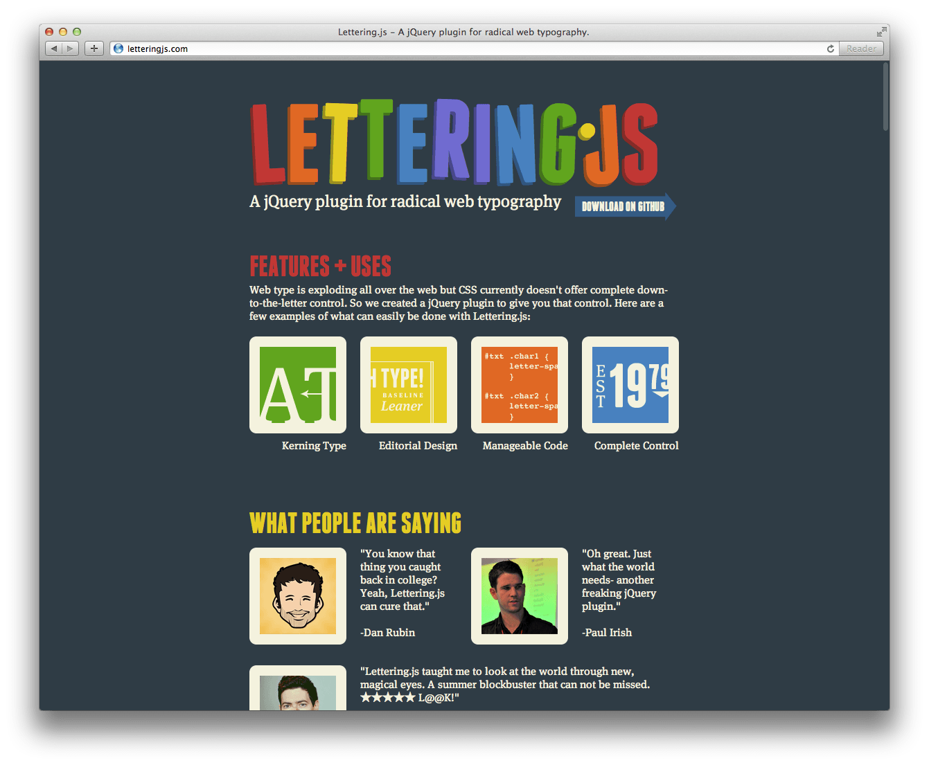
Lettering.js is a website I had come across before, but I always thought it was unnecessary for my web design purposes. Now I’m intrigued. Looking over the case studies I found this:
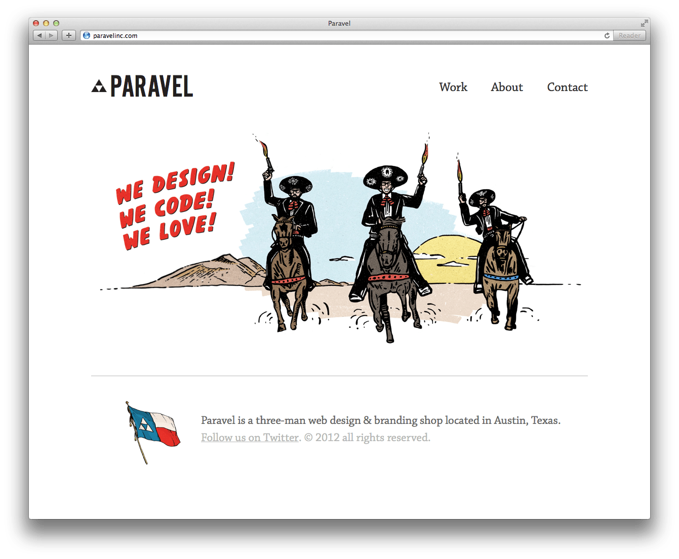
Paravel. And who runs Paravel? That Trent Walton dude. Pretty great landing page. Finally looking over their portfolio of projects, I found this project which made me very happy.
Lost World’s Fairs. Amazing! Especially the Atlantis one. I seriously have never seen anything like it before. Anyway I was so impressed I decided to tell all of you… because we are best friends.
